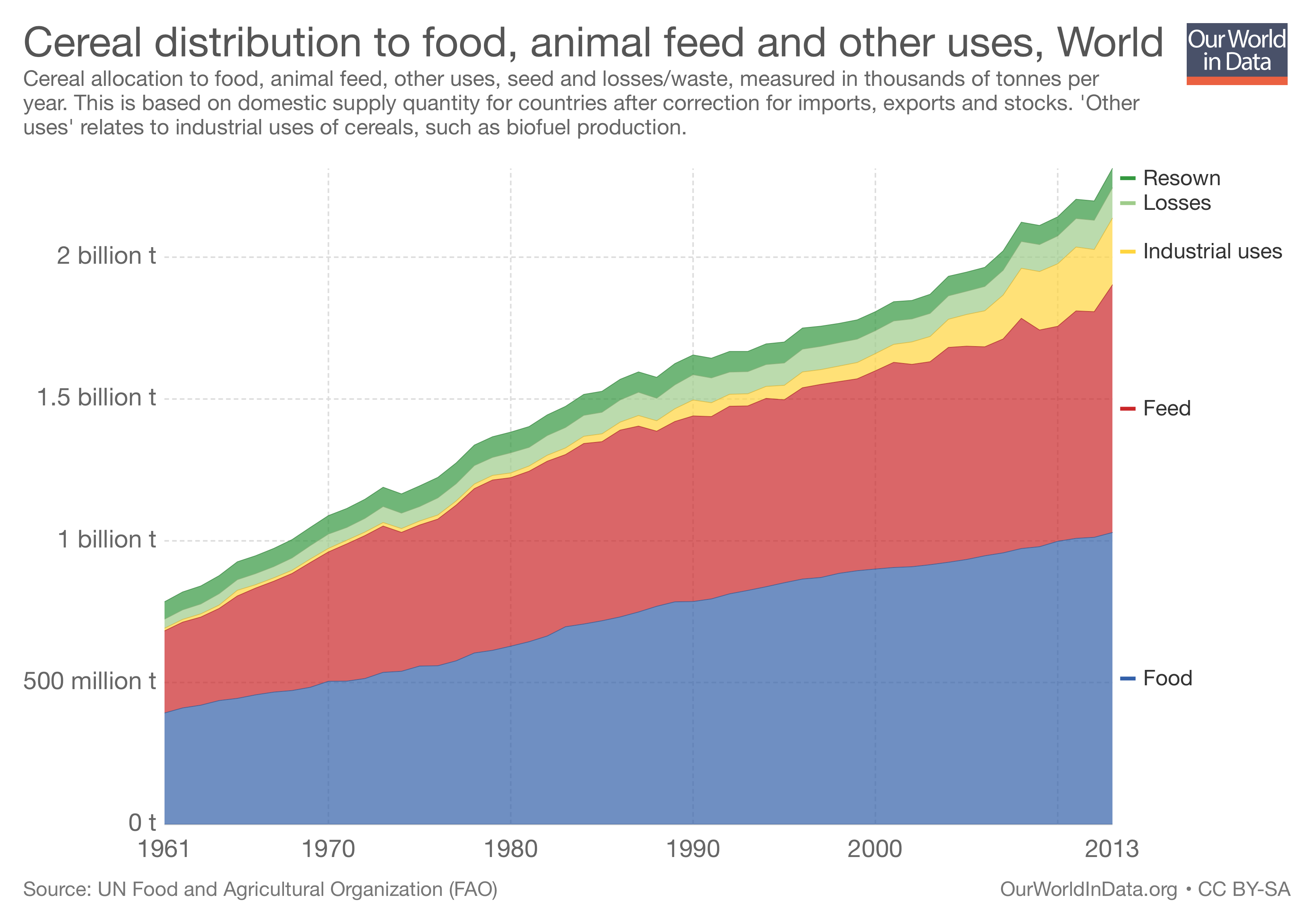
There was a teeny squawk on Twitter today when Tim Lang shared a graph of how the global harvest of cereals is divided up.
Look how use of cereals to feed animals has grown:
— Professor Tim Lang (@ProfTimLang) January 30, 2018
This is the graph he showed:

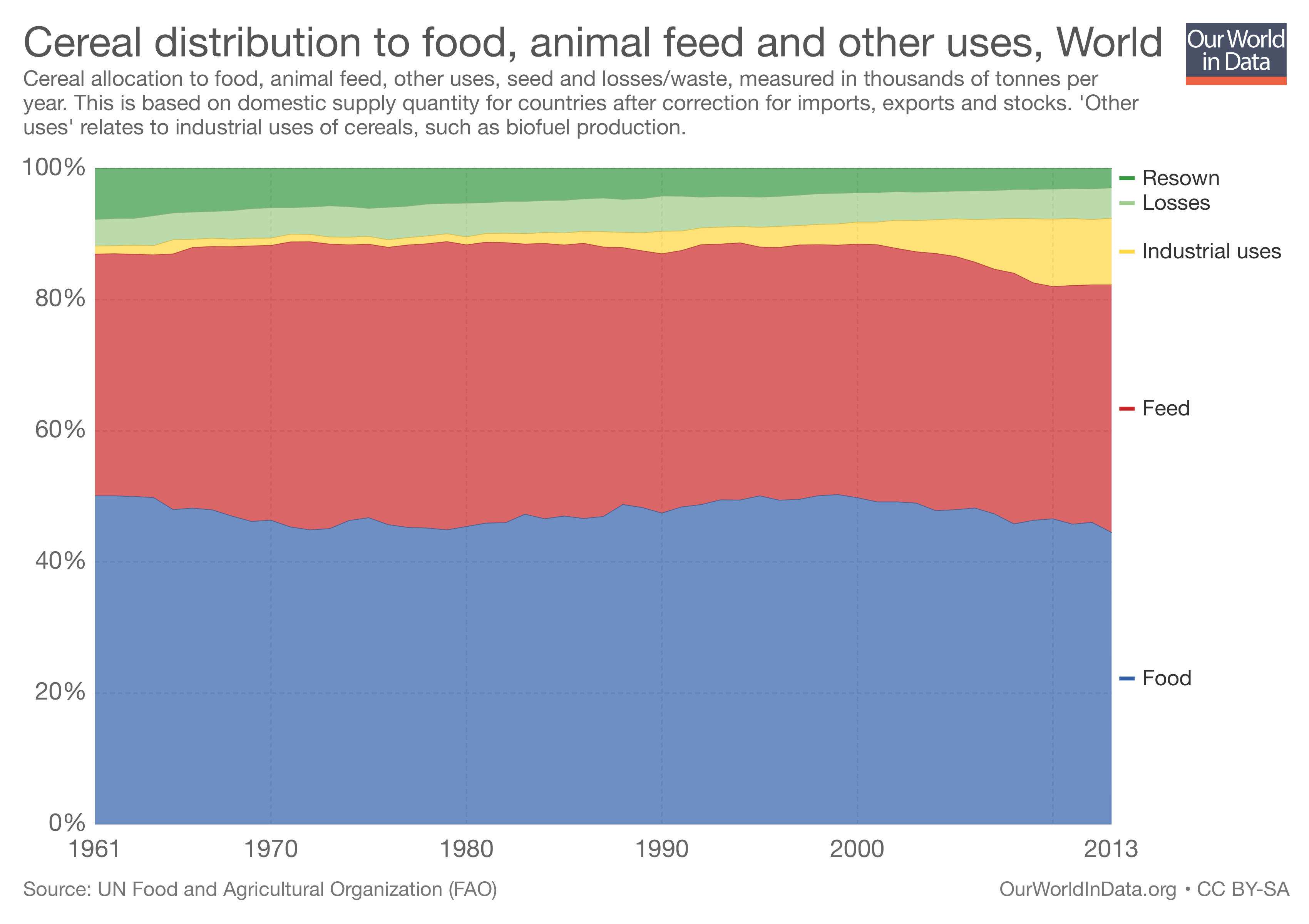
My old mucker Luigi was quick to point out that the same graph could be expressed as percentages of the total yield, and that shows a very different picture.

The actual numbers:
1961: feed 36.86% Food 50.07%. 2013: feed 37.77% food 44.49%. Industrial uses climbs from 1.22% to 10.15%.
Feeding animals cereals that humans could eat is a problem, I agree, but in percentage terms, the growth of cereals as an industrial feedstock -- biofuels, presumably -- is far more worrying.
Webmentions
Webmentions
Webmentions allow conversations across the web, based on a web standard. They are a powerful building block for the decentralized social web.
If you write something on your own site that links to this post, you can send me a Webmention by putting your post's URL in here:
Comments